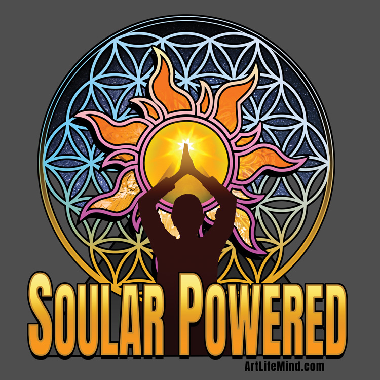
Stephanie – Tim brought up the idea of wanting to make a design around the words “Soular Powered” and I loved it! I have been obsessed with holding light and brining light lately so all I knew for sure is that I wanted there to be lots of light in the image. As I am not a graphic artist in any way, I feel fortunate that I can bring up what I would do in the studio with a brush and some paint and Tim masterfully interprets that with his mad skills. This is one of my favorite images so far!
Tim – We knew for this image that we wanted something that incorporated light, sacred geometry, and the words ‘Soular Powered’. Unlike previous designs, we were really experimenting and trying things in a very free form kind of way. I think that this was a ‘hurdle’ design for us, one where we were starting to move in new directions and incorporating what we had learned from our first attempts. It didn’t feel as easy, but as we stuck with it, the image slowly came together on it’s own.


